Some founders don’t have a clarity problem. They have a containment problem.
Shane Kenny had the wisdom. The empathy. Years of lived experience working inside family businesses, understanding the emotional undercurrents that most consultants never dare touch. He knew systemic coaching, psychological safety, youth mentorship — and he cared deeply about all of it. But caring about everything, without a brand to hold it, means the world sees nothing clearly.
His website wasn’t converting. His message wasn’t landing. He was showing up as another leadership coach in a sea of them — when what he actually was, was something far rarer.
We changed that.
Where We Brought Value
• Brand Strategy
• Brand Naming
• Finding Differentiation
• Reputation Building
• Message and Story Development
• Visual Expression
• Website Design
• Brand Supports and Coaching


The Work We Did
The first thing we did was stop trying to simplify Shane and start trying to see him — really see him. His hospitality background. His family dynamics. The way he holds space without flinching. These weren’t footnotes in his story. They were the story.
From there, we built a brand strategy that did what great strategy always does: it told the truth, clearly. We positioned Shane at the intersection of family business, emotional intelligence, and psychological safety — a niche that didn’t feel engineered, because it wasn’t. It was always there. It just needed naming.
And so we named it.
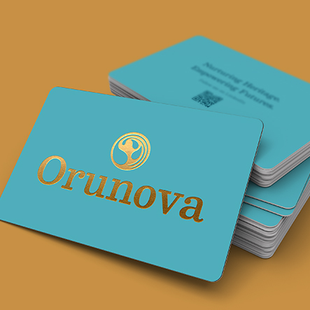
Orunova. A word we crafted with intention. “Ór” — Irish for gold, for legacy, for what’s worth passing on. “U” — because the client is always at the centre. “Nova” — because transformation is a kind of rebirth. Together, a name that doesn’t just sound different. It means something.
The visual identity followed the same logic. A circular logo, fluid and systemic. Water drops feeding into a family system — water, the quiet force that shapes without force. And at the centre, in the negative space, an androgynous conductor. Holding everything. Guiding the flow. Just like Shane.
We developed a brand narrative rooted in trust, emotional safety, and honest transformation — the kind of language that doesn’t perform warmth, but actually has it. His story became a bridge, not a broadcast. And we scoped a website structure built for calm and direction, because the families he works with have already lived enough chaos.
Then we stayed, in a brand advisory capacity, offering continued brand coaching, luxuriously printed business cards, website design and build, pull up banners — we worked alongside Shane until the brand wasn’t just a document, but a decision-making lens he carried with him.
The Result
Shane no longer pulls in a thousand directions. Orunova is grounded, focused, and growing, into a brand that stands apart from other leadership coaches, because it was never built to compete with them. It was built to speak to the founders and families who’ve already outgrown that world.
The families who need someone who gets it.
Nurturing Heritage. Empowering Futures.
That’s not a tagline. That’s a promise.