Some brands don’t need to be louder. They need to be more truthful to themselves
When Andriy, the founder of Ozone came to us, they were bleeding money into Google ads that weren’t working, watching competitors and mimicking their moves, even considering a pivot into security — not because it made sense, but because the anxiety of standing still had become unbearable. It’s a familiar trap. When you don’t know what you stand for, you start chasing what others seem certain about.
But certainty was already inside Ozone. It just hadn’t been named yet.
Where We Brought Value
• Brand Framing
• Finding Differentiation
• Finding Brand Values
• Finding True Purpose
• Map the brand to the business
• Brand messaging
• Website Design
• Tweaking Master Files


The Work
We don’t start with strategy. We start with listening. And what we heard, underneath all the noise, the wasted budget and the copycat thinking, was something that stopped us in our tracks.
Ozone’s clients didn’t just trust their cleaners. They called them family.
That’s not a marketing line. That’s a brand truth — and a rare one. In a commercial cleaning industry that competes almost entirely on price and scope, Ozone had built something that money can’t manufacture: genuine human loyalty. The kind that gets referred. The kind that stays.
Our job was simply to make sure the world could finally see it.
We refocused the entire brand strategy around that truth — people, dependability, and the quiet excellence that facilities managers feel every single morning when they walk into a space Ozone has cared for. We repositioned them not as a cleaning company, but as a partner. The kind that gives time back. That removes the mental load. That shows up — every time, without drama, without chasing.
We recommended a naming clarification too: back to Ozone Commercial Cleaners. Not the vague, corporate-sounding “Ozone Group.” Clarity is its own kind of confidence.
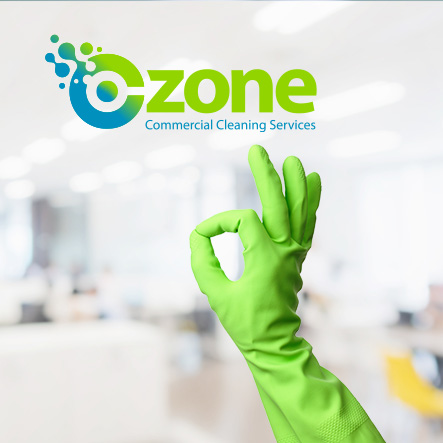
The visual identity didn’t need a revolution — it needed breathing room. Ozone’s logo had equity worth keeping, so we kept it, it was a good logo. What we changed was the atmosphere around it. Heavy navy gave way to lighter, airier tones. Dark, shadowy imagery — drab carpets, gloomy corridors — was replaced with bright, breathable spaces that actually looked like what Ozone delivers. The brand stopped looking like the problem and started looking like the solution.
And the messaging found its spine. Ozone is now positioned as the partner facilities managers can genuinely trust — not the loudest option, but the most reliable one. The one that returns something intangible alongside spotless floors: peace of mind.
The Result
Ozone stopped chasing and started leading. Not with noise, with consistency. Not with clever campaigns, with character.
In a crowded, commoditised market, the most radical thing a brand can do is refuse to compete on everyone else’s terms. Ozone found its own terms—relationships over reach, loyalty over volume, presence over performance.
They don’t need to shout. They just need to show up.
And that, it turns out, is exactly what they’ve always been best at.
